Transform Your Space with Tiles, Grout & Accents
When you're renovating your home it’s often the colours and details that define how a room feels. Colour choices shape mood and flow, and dictate how the light bounces around the room. Meanwhile, finishing touches - from grout to trims to screws and fixings - can elevate your project from “nice” to unforgettable. This guide shows you exactly how to use tile colours, grout, trims, and styling accents to design a space that feels uniquely yours and give your guestst home envy.
Tile Colours & Patterns: Let's set the Mood
Tiles aren’t just a backdrop, they can be the star! Colour is one of the most powerful tools in interior design, instantly changing the feel of a room. Our tiles can set the tone for any space; stone effect tiles add a sense of calm to bathrooms, serene wood effect tiles help slow the pace in busy kitchens, and colourful metro tiles inject a splash of colour and energy into a space. Here's some of our best selling tiles with examples of how they can be used to transform your space.

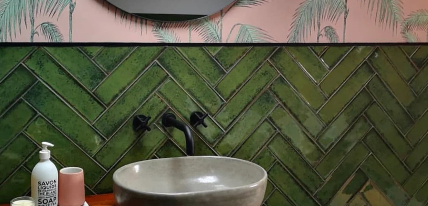
- Vintage Olive Green Metro Tiles - earthy, grounding tones that bring calm and a cocooning feel to kitchens and bathrooms. The rich green colour pallette calls back to bottle green art deco tiles, whilst the distressed gloss finish plays light around your room.
- Vintage Blue Metro Tiles - bold and characterful blue with a distressed glaze; tranquil yet energetic when paired with crisp lines. This popular chic tile is ideal for creating a colourful nautical warm rich with mediterranean charm.
- Amazon Jungle Decor Tiles - dramatic patterned tiles create statement walls that create a dynamic focal point. This jungle patterned tile creates a central point, whilst the leafy jungle print helps to create a sense of calm and natural feel - making it a favourite for feature walls in bathrooms.
Design tip: Light tones open up a space and feel airy; deeper colours add intimacy. Large-scale patterns create a visual anchor, especially in open-plan areas.
Grout Colours: The Unsung Hero
Much like the frame around a painting, tile grout can dramatically alter the appearance of your tiles. Use tile grout to either make tiles blend seamlessly, or stand out with contrast and definition. Decide early whether grout should disappear or perform as part of your feature.
- Match the grout for a continuous, calm surface (e.g., olive tile with soft green grout, or grey stone effect tiles with grey grout).
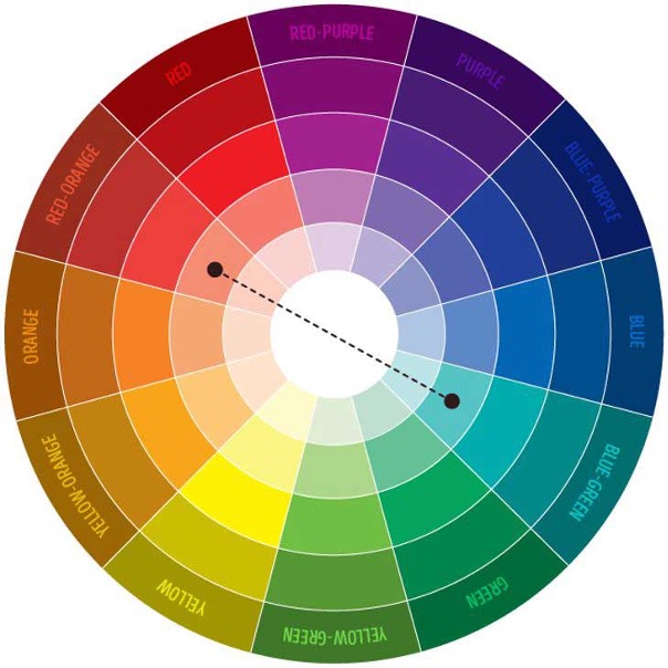
- Contrast the grout to emphasise shape and layout (e.g., white with blue for crisp edges, or playful pink with green for a bold twist).
- Light vs. dark shifts both mood and maintenance: light feels fresh; dark adds drama and can be forgiving in busy zones.
Luckily there are now a multitude of grout colours available. Kerakoll Fugabella's grout choice encompasses 50 colours, whilst Mapei's Ultracolor range focuses on the most popular colours. Explore our wide tile grout colour ranges:
Tile Trims & Finishing Touches: Beyond Black, White & Silver
Tile trims and profiles are no longer an afterthought. They’ve become an integral part of the design language thanks to the availability of a wide spectrum of colours and finishes. Remember, most tiles aren't the same colour on the sides as they are on the front. This means your stunning green tiles may have beige - or even red - back and sides. Tile trims help to cover these edges, replacing these colours with a colour matched choice chosen by you.

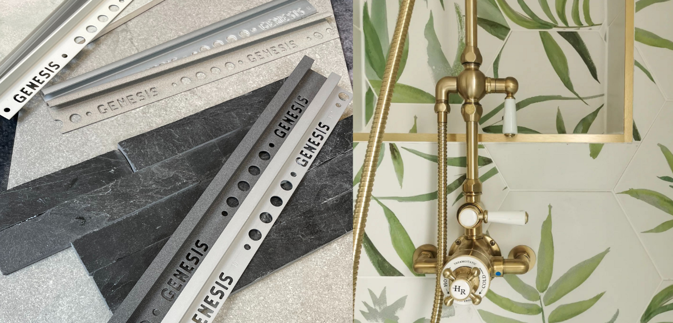
- Genesis ESA Aluminium Straight Edge Trim — extensive colour and finish options to complement or contrast your tiles. This wide range encompasses any colour you could ever need, with a custom powder coating option available too!
- Mapei Colour Aluminium Trims — practical colour-matched edging to finish transitions cleanly, focusing on popular UK colours. Extensive research has helped inform colour choices that blend into most interior design scenarios.
- Dural Colour-Matched Movement Joints — seamless expansion solutions without visual compromise. Dural also offer a colour matching powder coating service for tile trims too - for when your trims absolutely have to match pre-existing features or your tile choice!
Design tip: Treat trims like jewellery: let them quietly blend, or use them to add a precise, intentional highlight line around your tilework. We think they look best when used to compliment your tiles.
Accents & Styling: Tie the Room Together
Colour co‑ordination goes beyond the tile surface. Styling choices complete the look and influence how the room feels day-to-day. Let's explore how you can add different textures and tones to build upon your tile choices!

Greenery & Texture
Indoor plants soften hard surfaces and connect interiors to nature. We think these are perfect with earthy tones like Vintage Olive, and constrast the distinct lines of stone effect tiles to create a calming oasis. Consider layered textures (linen blinds, timber stools, rugs) to balance gloss tiles.
Design Directions
- Maximalism: lush pattern, saturated colour, layered art. Try a patterned hero wall with Amazon Jungle and pick a vibrant grout or trim. Read more about maximalism design in House Beautiful.
- Minimalism: restrained palettes, clean lines, negative space. Pair Vintage Blue with matching grout and slimline trims for a serene, gallery-like feel. Explore minimalism at Ideal Home.
- Scandi: light woods, soft whites/greys, tactile layers. Balanced warmth and simplicity work beautifully with desaturated tiles. Feel the Scandi inspiration in this article from Livingetc.
Micro‑Accents & Hardware (Seamless Colour Continuity)
Carry colour through the finer points: shelf brackets, face-fix profiles, signage screws, and visible fixings. For a truly cohesive finish, specify RAL‑colour‑matched screws and fixings from RALfixings. Powder‑coated to any classic RAL shade, they blend with tiles, trims, and painted surfaces — ideal when you want hardware to disappear or subtly echo a feature hue.
Conclusion: It’s All in the Details
Tiles set the stage, but colour co‑ordination across grout, trims, styling - and even the smallest fixings - creates a cohesive, elevated interior. Whether you’re drawn to the bold confidence of Vintage Blue, the natural calm of Vintage Olive, or the drama of Amazon Jungle, remember that every detail shapes the mood of your home.
Ready to explore colour in your own project? Order your free tile samples from London Tile and experiment with combinations in your space.


